ConvoScope
Designing an experimental AI interface for MIT Media Lab researchers.
My Role
Lead Product Designer – Interaction Design, UX Design, Visual Design, User Flows, Prototyping
Timeline & Status
Q3, Q4 2023 Design Stage
Currently in development
Team
Ayon Bhattacharya, Co-Designer
Cayden Pierce, PM + SE Lead
Alex Israelov, SE Lead
Kenji Phang, SE
Cayden Pierce, PM + SE Lead
Alex Israelov, SE Lead
Kenji Phang, SE
Overview
Students in the MIT Media Lab wanted more information at their fingertips when having conversations with peers, and when listening to research presentations.
I paired with researchers at MIT media lab to create a tool to aid in seamlessly surfacing additional information during lab meetings.
I worked on the end-to-end design of the desktop application.
Our app was presented and used at MIT, meaningfully improved the quality of research conversations, and is currently being adapted for use with AR by Team Open Smart Glasses.

The Problem
Researchers had trouble surfacing relevant information on-the-fly when discussing unfamiliar or new topics.
Highlights
Information must be easy to access, legible and useful.
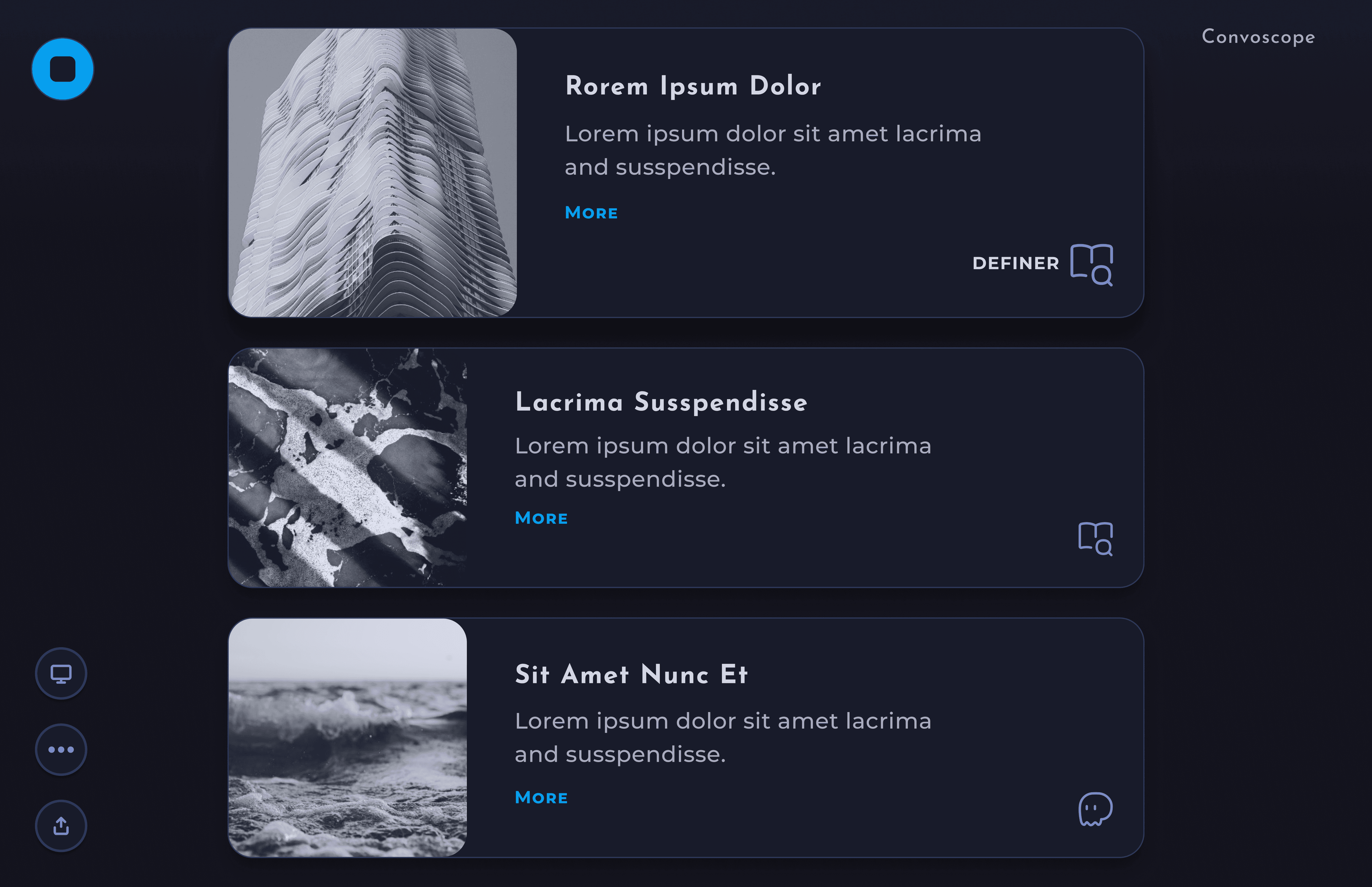
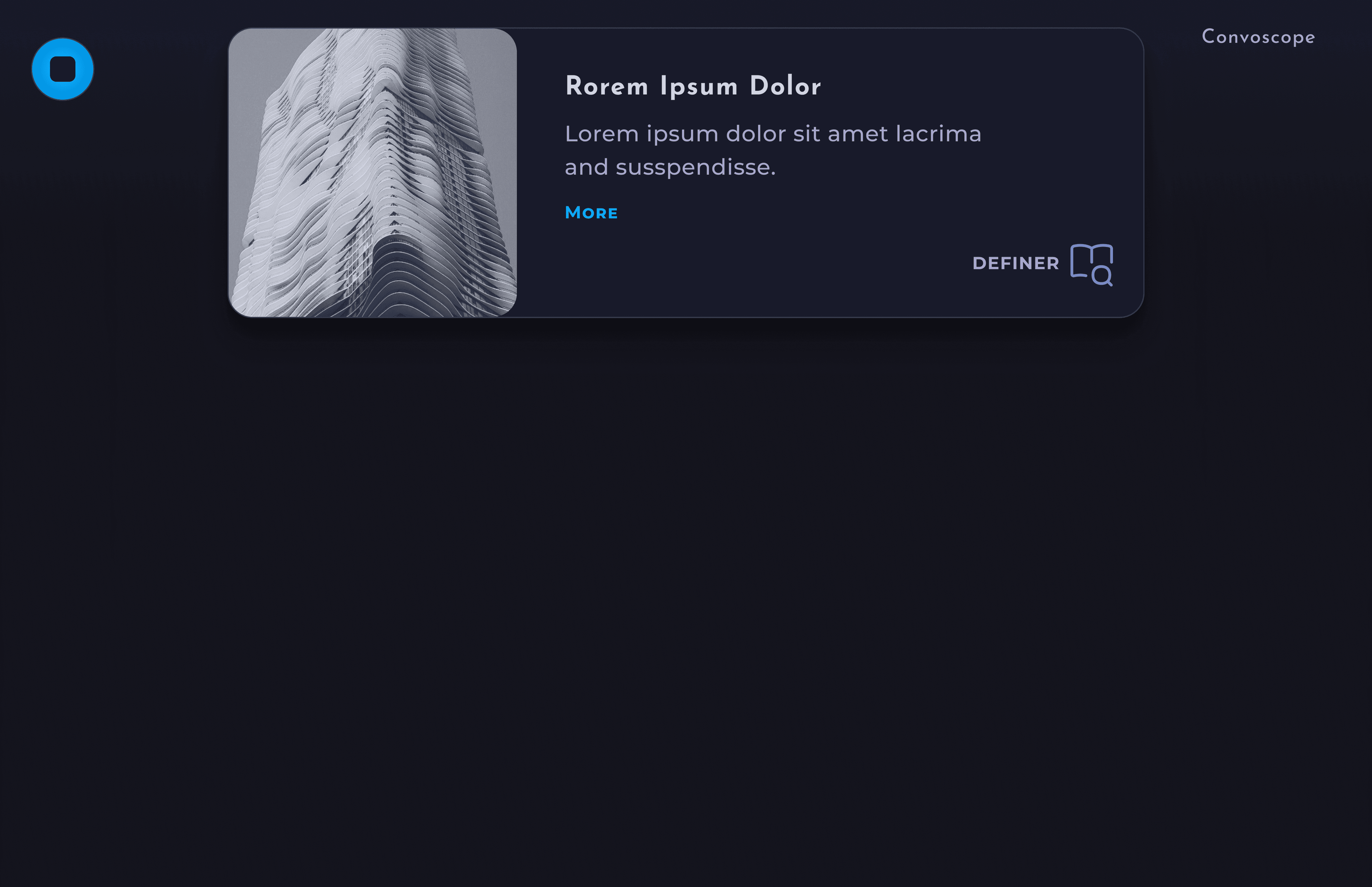
With ConvoScope, users don’t waste time entering requests into a search tool. When activated, the tool listens to the users’ conversation and, with the help of AI, automatically outputs succinct information, aiding in a deeper understanding of the topic at hand.
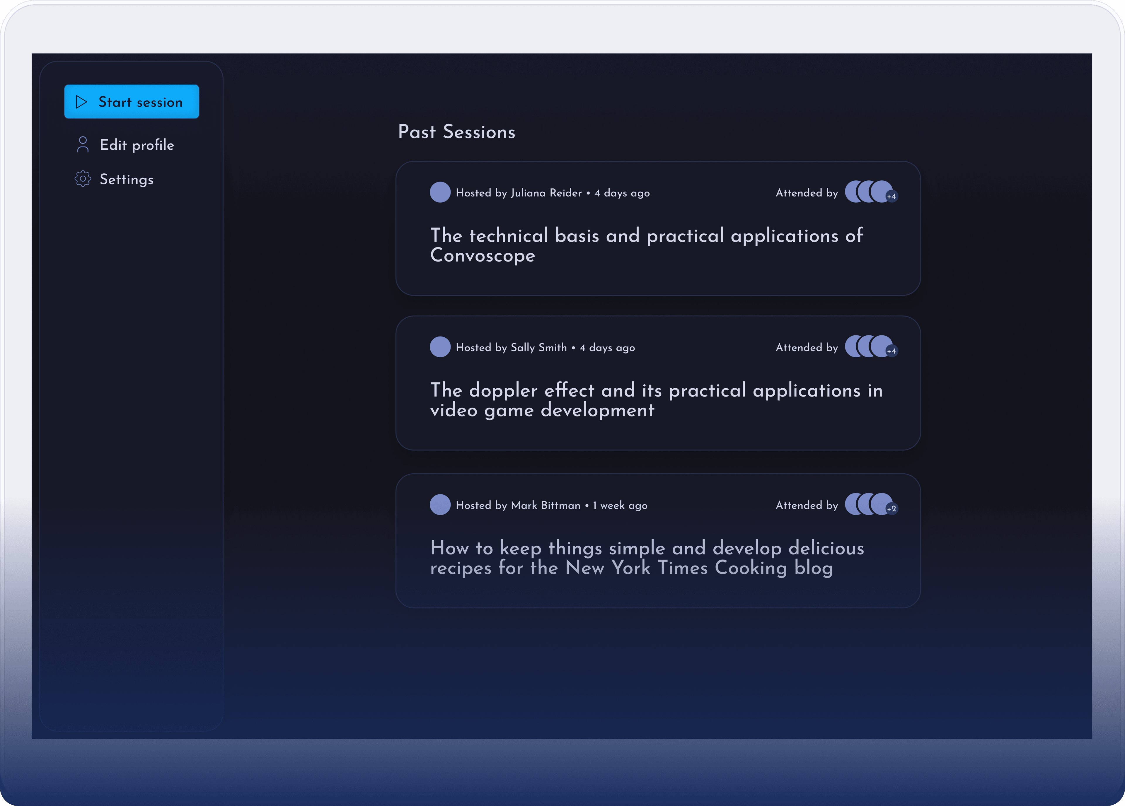
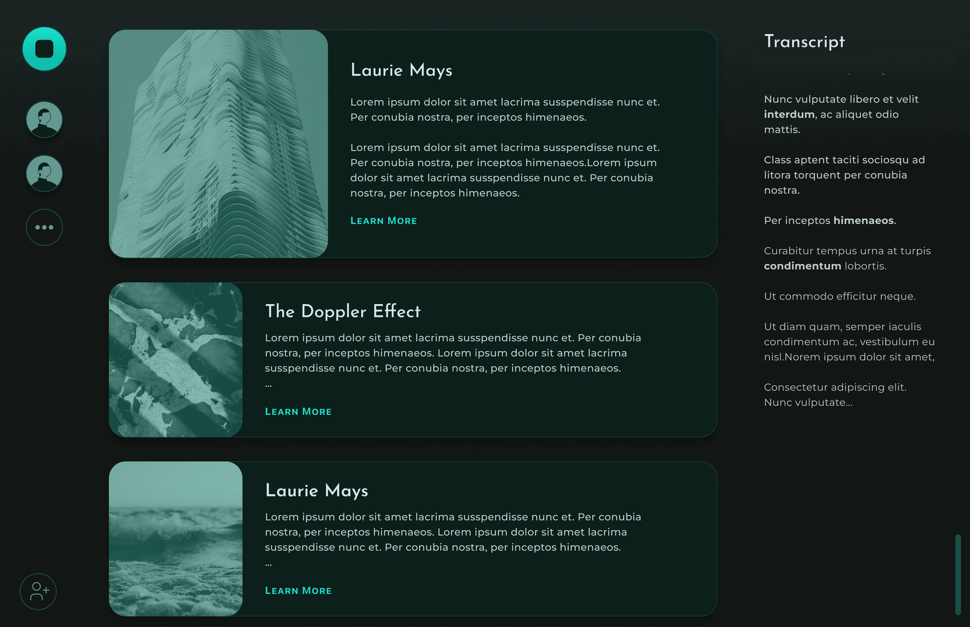
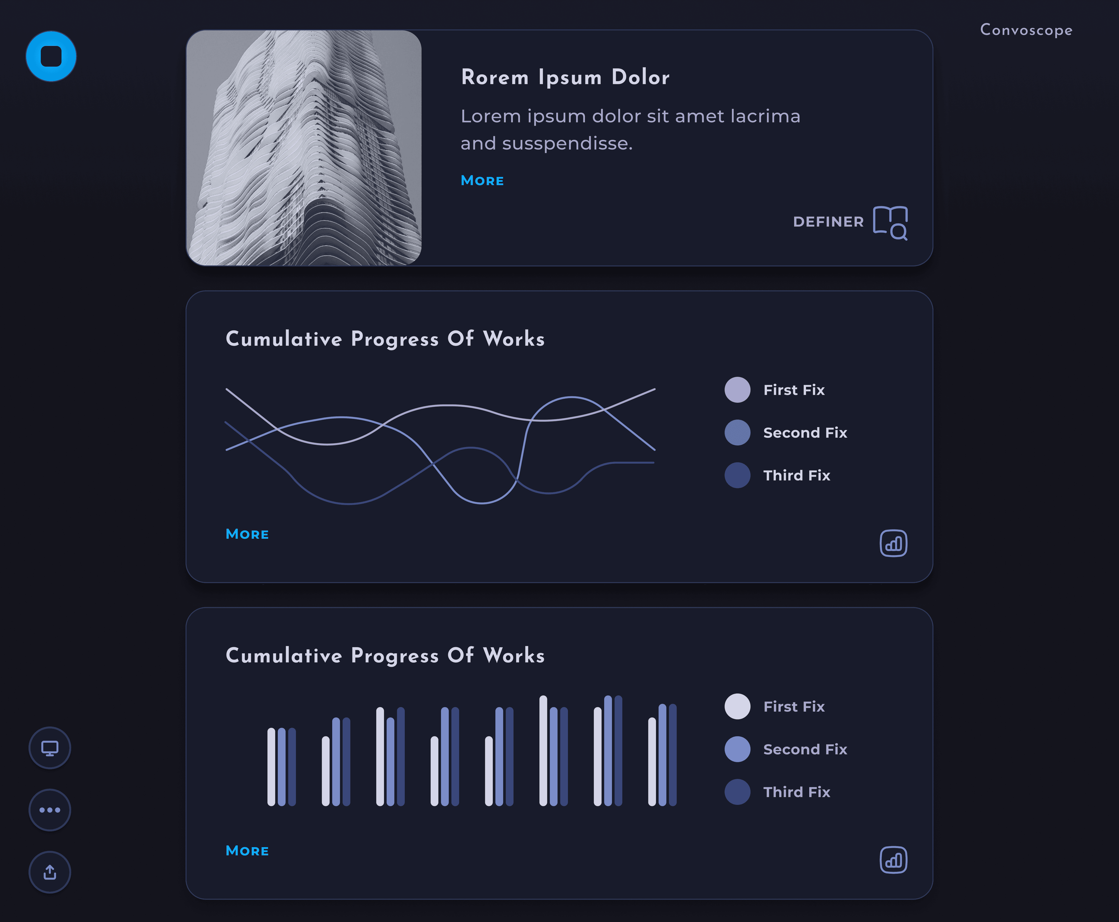
Main screen - Cards flow in from the top, and are pushed out the bottom.

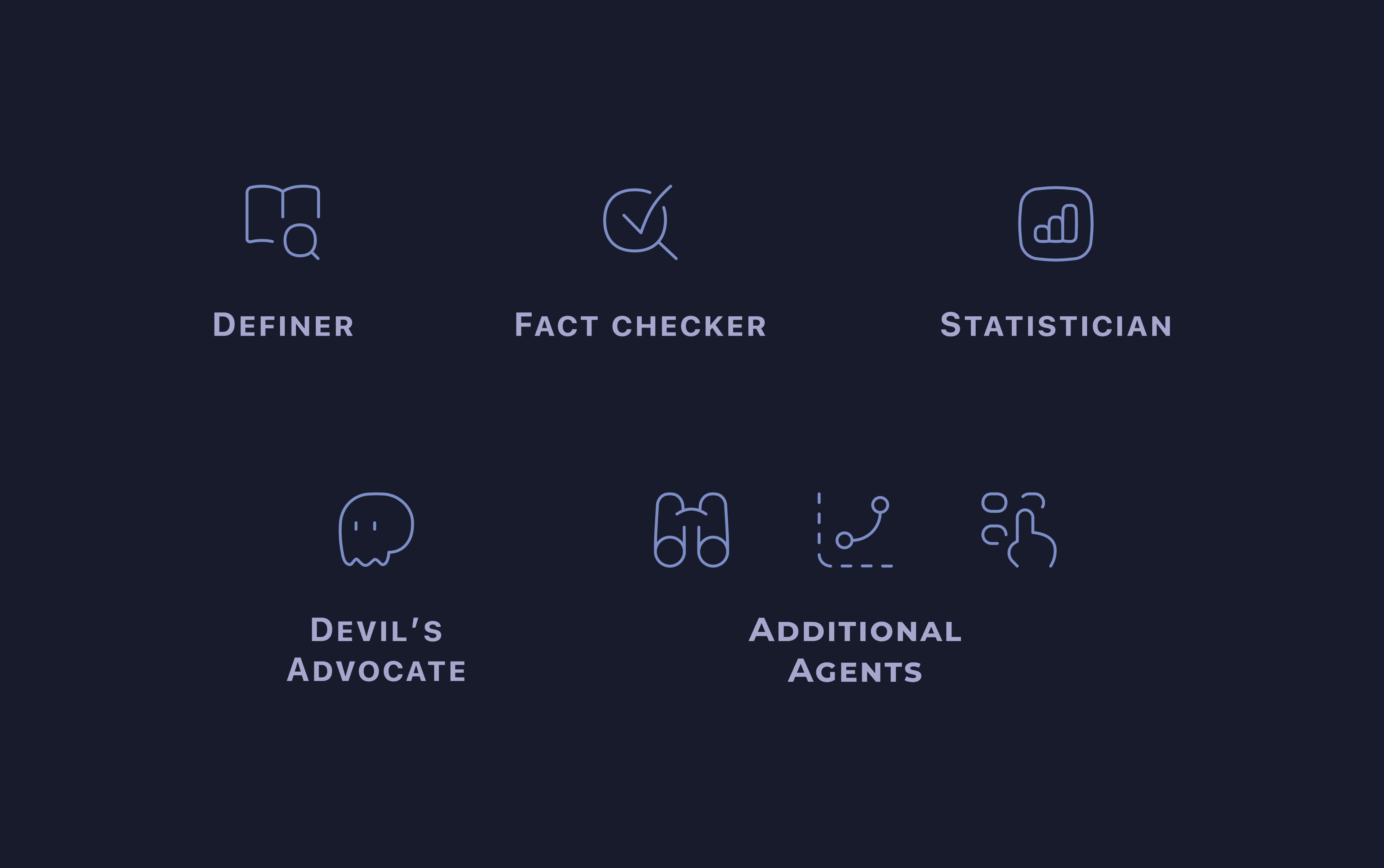
Key Features
• Information is easy to access
• Definition of key terms
• Fact checks + corrections
• Expert opinions
• Oppositional theories + more
• Information is easy to access
• Definition of key terms
• Fact checks + corrections
• Expert opinions
• Oppositional theories + more
Quick to Scan
• Cards provide visual separation
• Limit of 7-12 words per card body
• Typography chosen carefully for legibility
• Absence of clutter
• Throttled quantity of cards produced

Speaker Mode
Participants only see cards
selected by the Speaker
selected by the Speaker
Default Mode
All participants see the
full set of cards
full set of cards
Speaker View– In Speaker Mode, the speaker selects the cards to highlight.
Participant view– Participants will see only the selected cards.
The rationed output will help highlight the most useful information and minimize distractions.
“Hey Convo”– Voice interface available for users to ask burning questions.
Research
An empathetic and research driven approach.
I conducted user interviews, created personas, incrementally iterated on the design, integrated SME and user feedback to hone the best product possible.
Questions Included
• What is the biggest pain point related to participating in research discussions?
• What other solutions or workarounds have you tried?
• What do you like about how you currently solve your pain point?
• Do you feel this design was made for you? Why or why not?
• What's the single most important thing we could do to make ConvoScope better?
• What other solutions or workarounds have you tried?
• What do you like about how you currently solve your pain point?
• Do you feel this design was made for you? Why or why not?
• What's the single most important thing we could do to make ConvoScope better?
Main Insight
Current tooling produced too much irrelevant information to sort through in a timely manor.
Additional Insights
Users were much more likely to quickly find the info they needed if the output in the app was collected, curated, and concise.

During discussion, students routinely wanted access to supplemental information quickly

Flow should not be disrupted

Irrelevant information should be hidden so no time is wasted reading it

There was a desire for all information to be collected in a single location
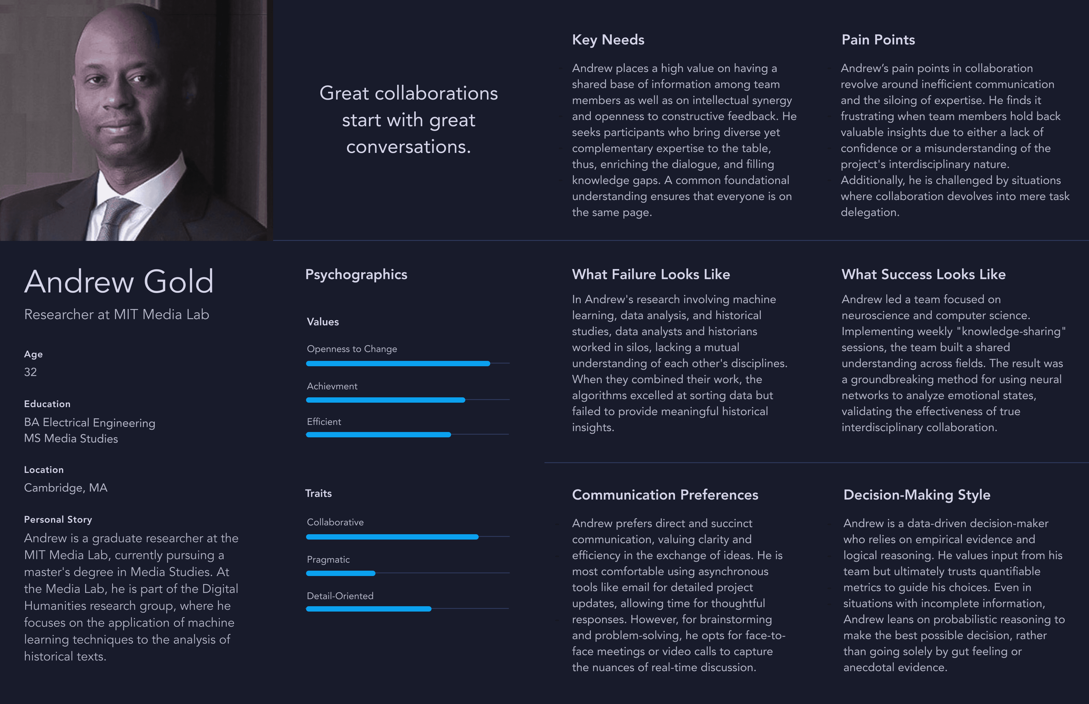
Persona
Ideation
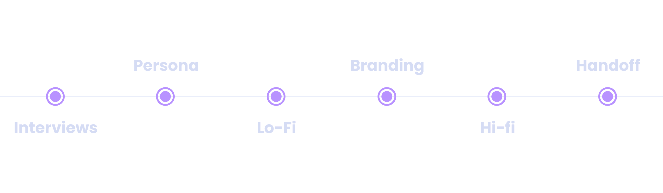
Honing in on an impactful solution– step by step.
Before diving into the more detailed designs, I started with some quick iterations with hand drawn ideas, and moved onto low fidelity wireframes in figma.
Wireframes

Iterations and Deliverables
Weekly Demos
Presentations of current designs
and prototypes
and prototypes
Iterative Feedback
Gathered continuous feedback
from users and devs
from users and devs

Artifacts Delivered
Figma designs, animations,
and style guides
and style guides
Process
Initial Directions
The look and feel of the app was undefined as of yet.
The main stakeholder had some great ideas for for the look and feel of the app, but we needed to narrow it down. We started with a branding exercise where we defined and refined our general style direction.
Design Language– We decided that the app should have an otherworldly feel, but also evoke harmony, while fitting into an academic context. I prepared and presented two styles to our stakeholder, in order to get a sense of which direction fit the product best.
Initial Directions– At first the stakeholder resquested the green theming. Thus, I continued to iterate on the formatting and other aspects of the application in green. Some iternations shown below.
New Direction– In the end, we went with a combination of the two styles. The softer cleaner visual style fit our branding goals of serious and harmonious and the blue color theme was chosen for better contrast and legibility overall.
Testing + Improvements
The path of successful design never did run smooth.
In order to have the best product possible, eliciting, and prioritizing feedback are paramount. During the course of design iterations, I updated the design based on feedback in order to have the largest impact. Following are a handful of those improvements.
Increased Legibility

Before: At first Users found the contrast in the initial designs difficult to read.

After: once color and sizing was dialed in, students were able to read the interface clearly from their seats at the back of the lecture hall in MIT media lab.
Clean it up
The space was cluttered and I needed to make the app more breathable, which would in the end make the app more usable.
Before: The transcript element was distracting to the people I interviewed and deemed unhelpful beyond cuing the listeners that the app was active.
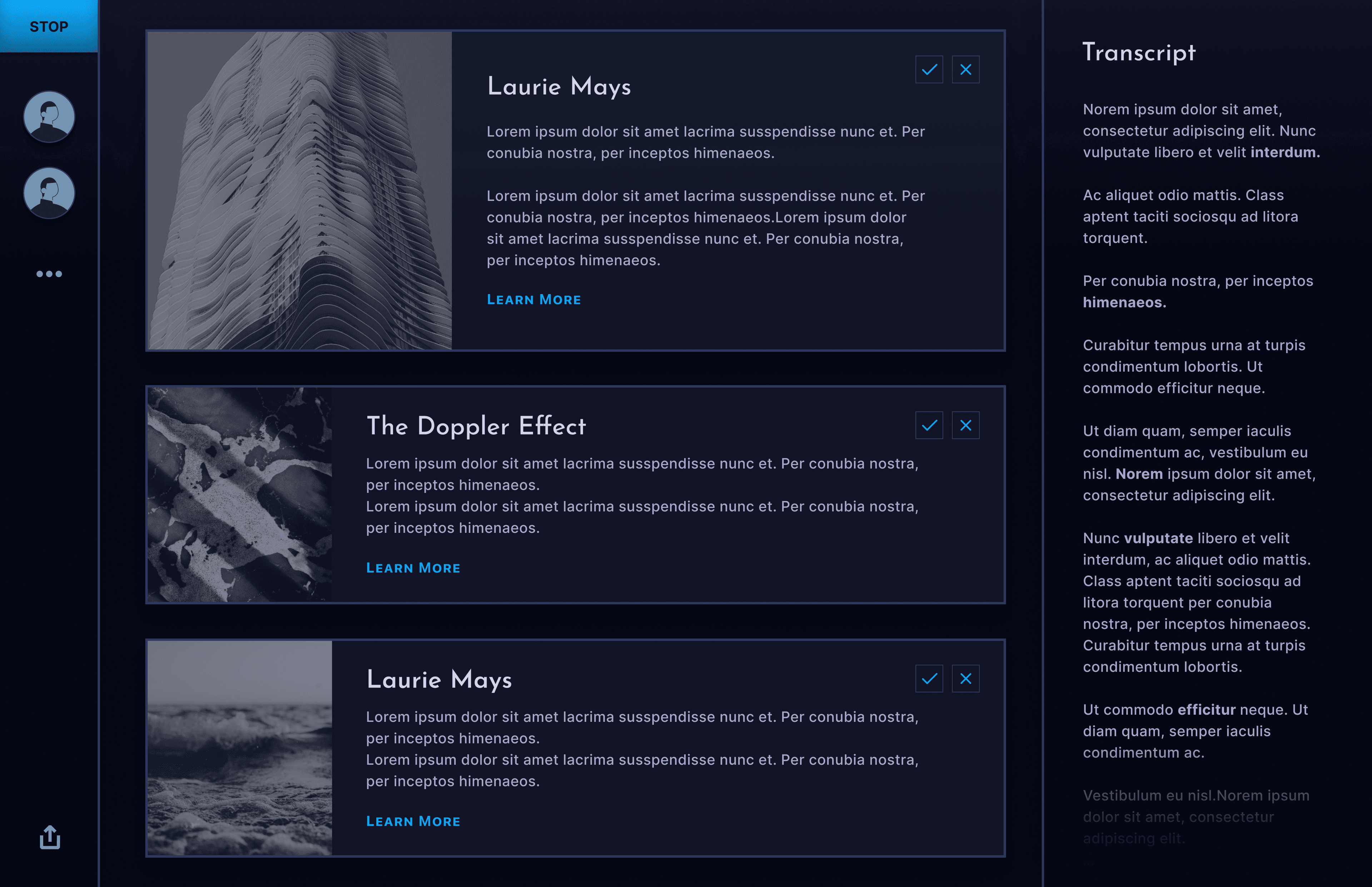
After: Removed distracting elements, such as the transcript and the side panels, while maintaining clarity.
After: We added a button animation, and text which indicated the app was processing before any cards were created.
Hone in Imagery
Before: Our icons and use of emojis didn't quite fit the design language and proved to be distracting.
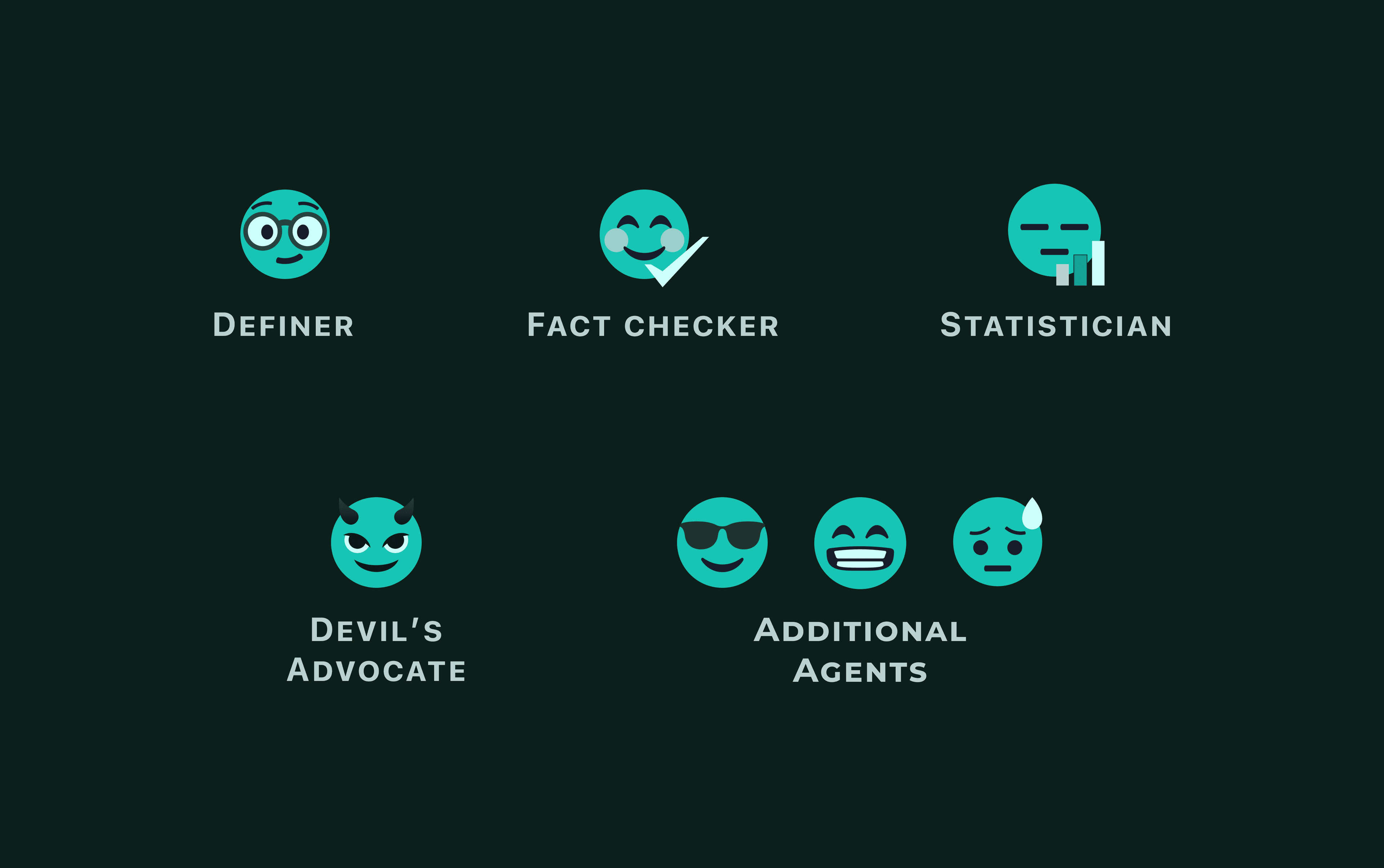
After: The icons created to replace them fit the look and feel much better. They were rounded, breathable, and identifiable at a glance without being too distracting.
Final Design
I was proud of what I had created.
After many iterations and experimentations, here are some of the elements I wish to highlight.
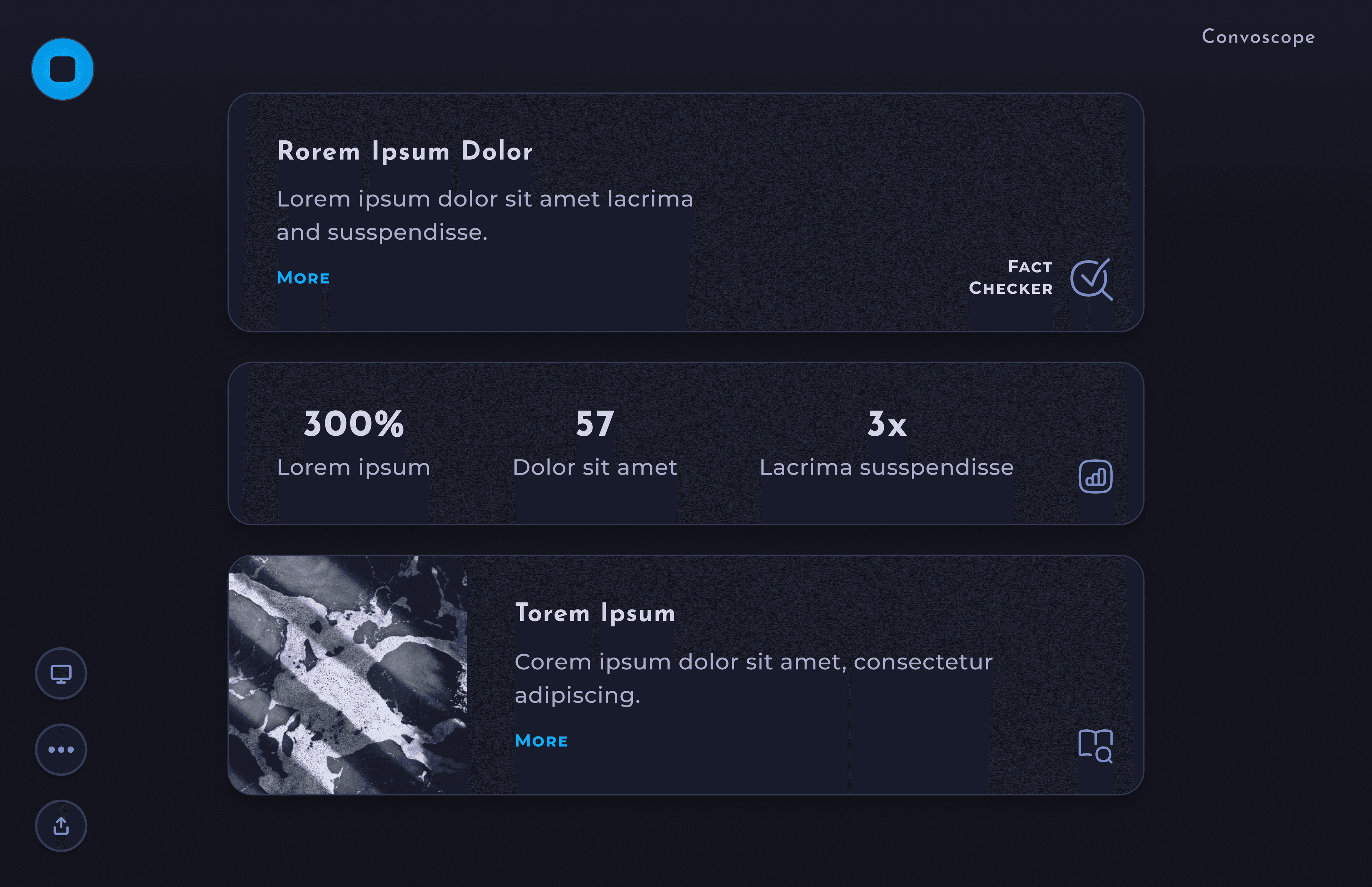
Major Screens
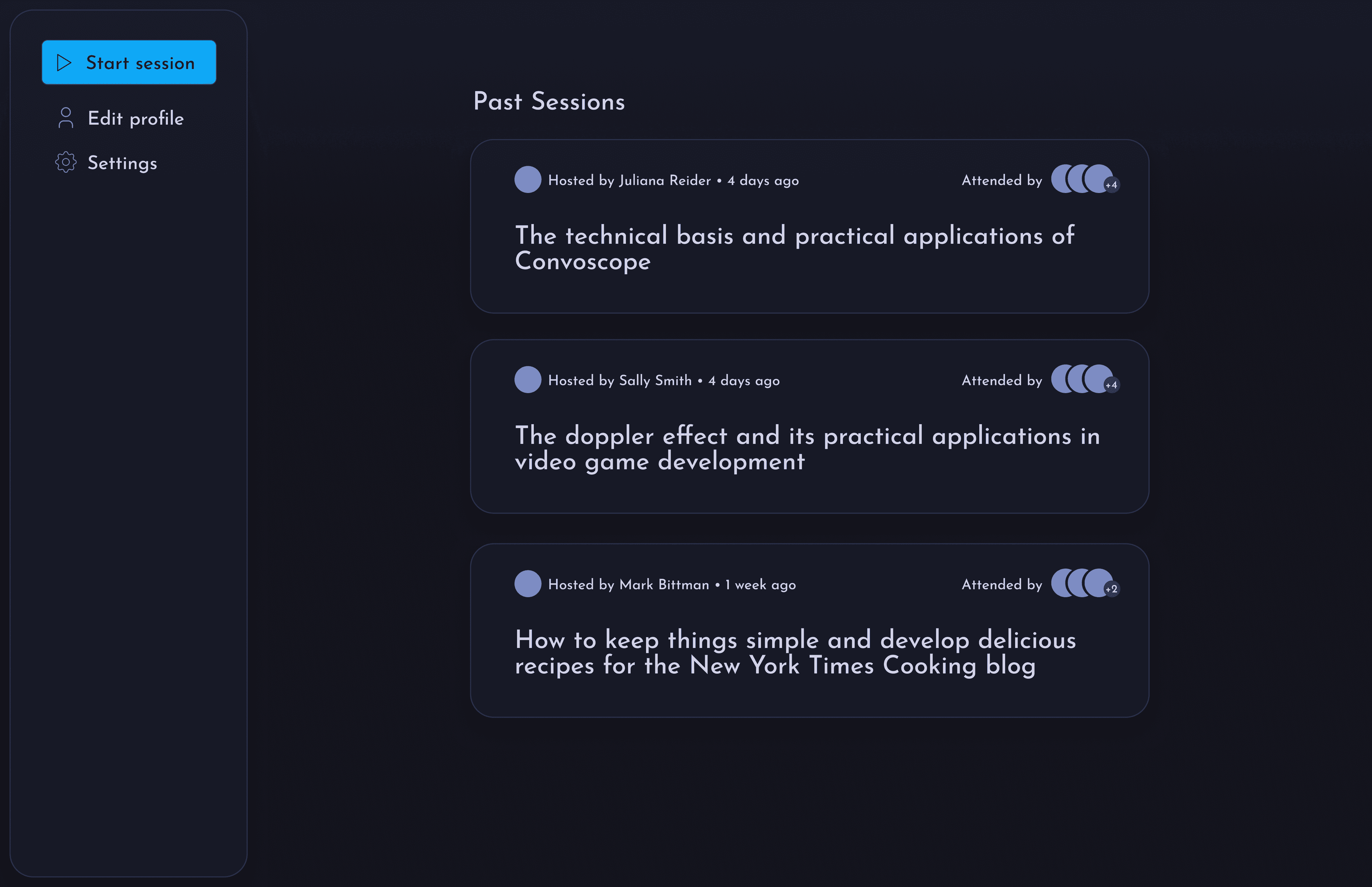
Landing Page– Start a new session or view archive of past sessions.
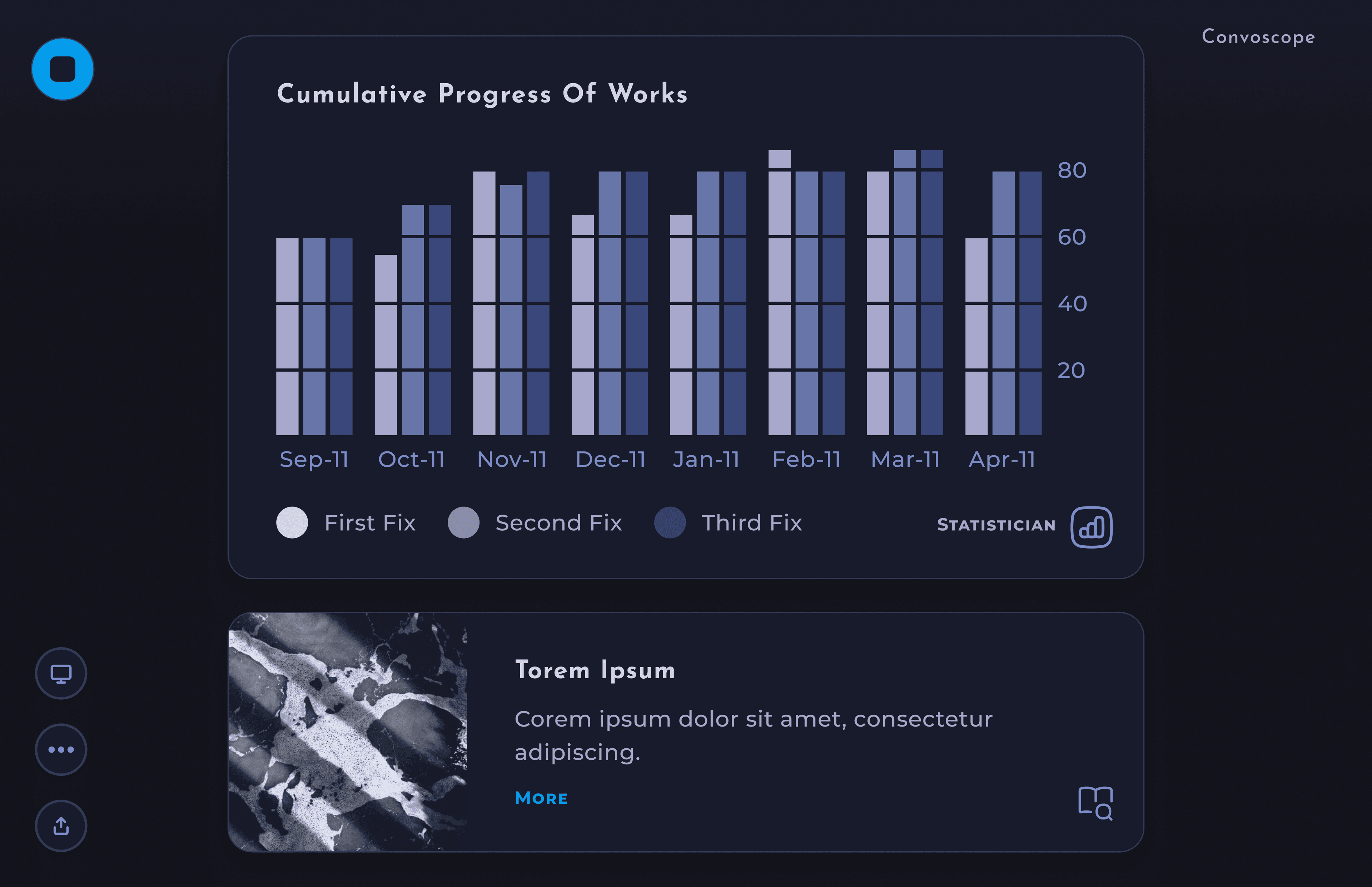
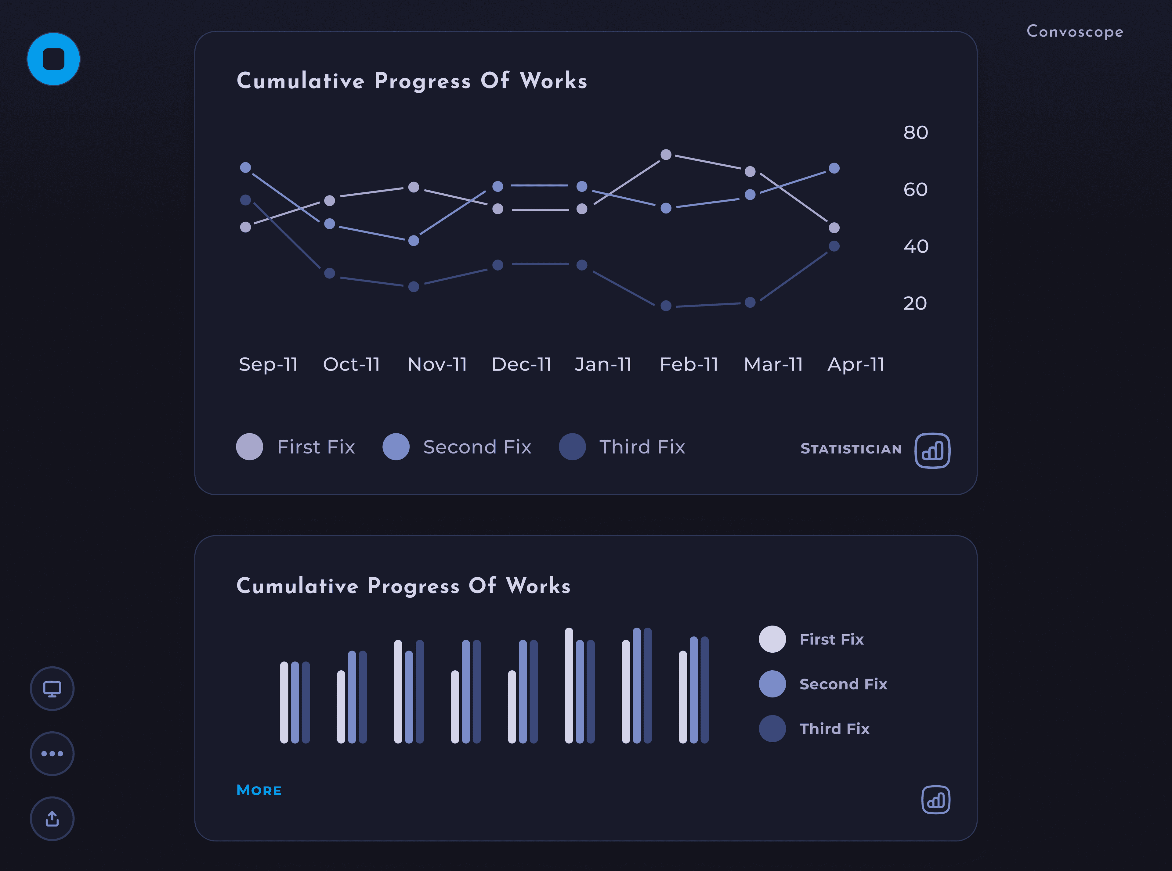
Data Visualizations– Make statistics and data display in a more visual format for quicker consumption.

Hey Convo– Ask convo anything!
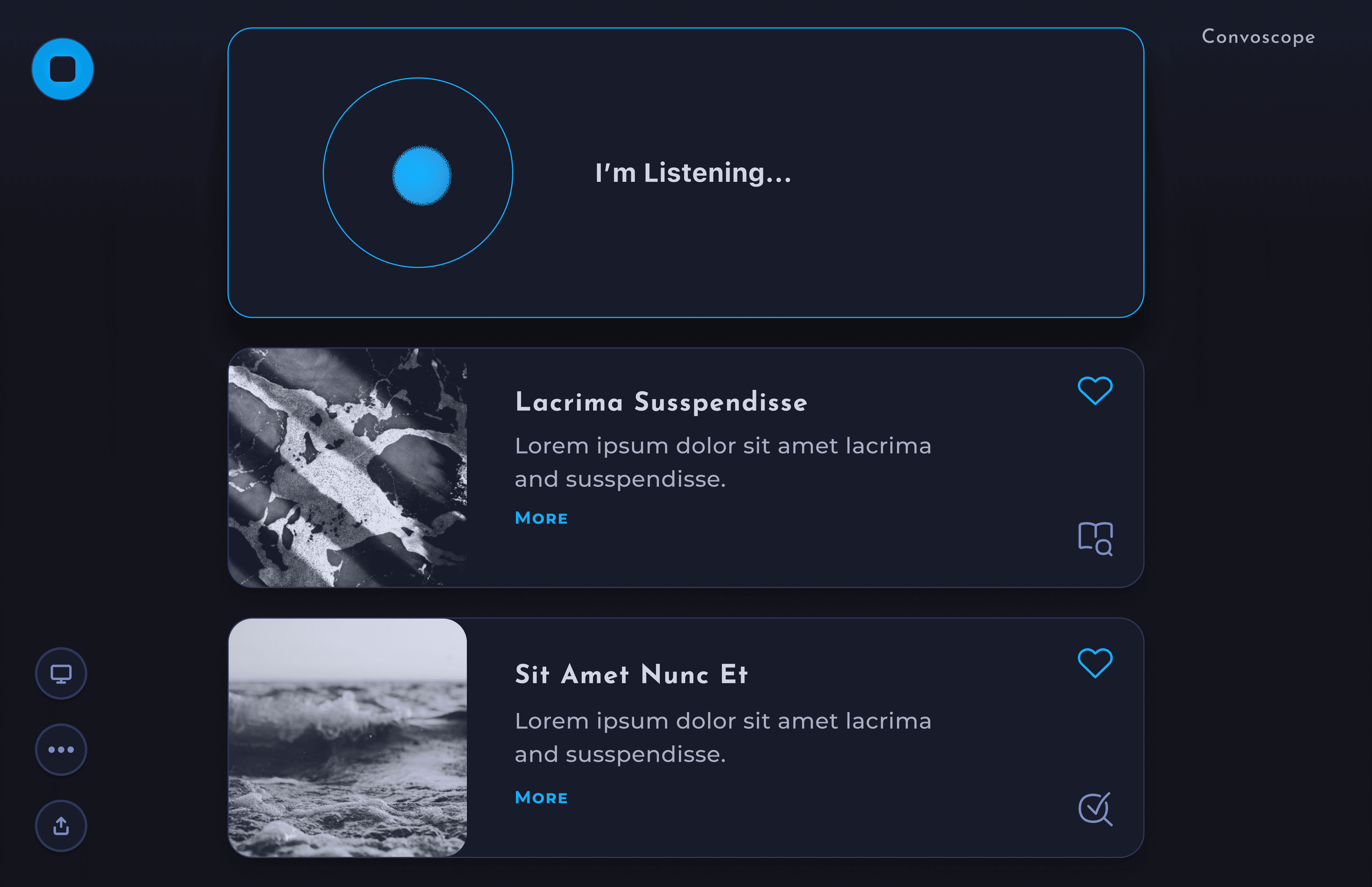
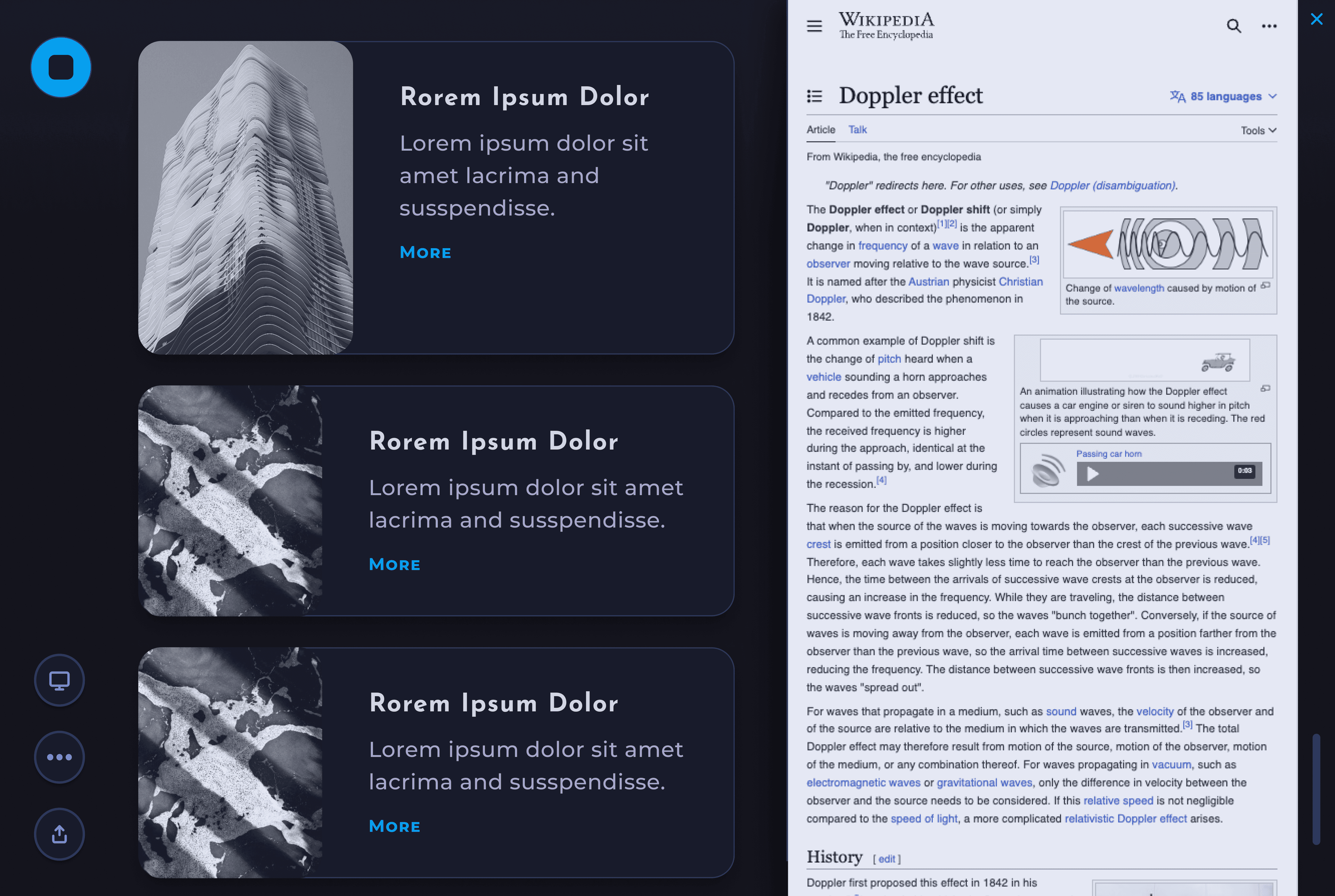
See More Info– Click the "More" button for a card to display the source webpage.
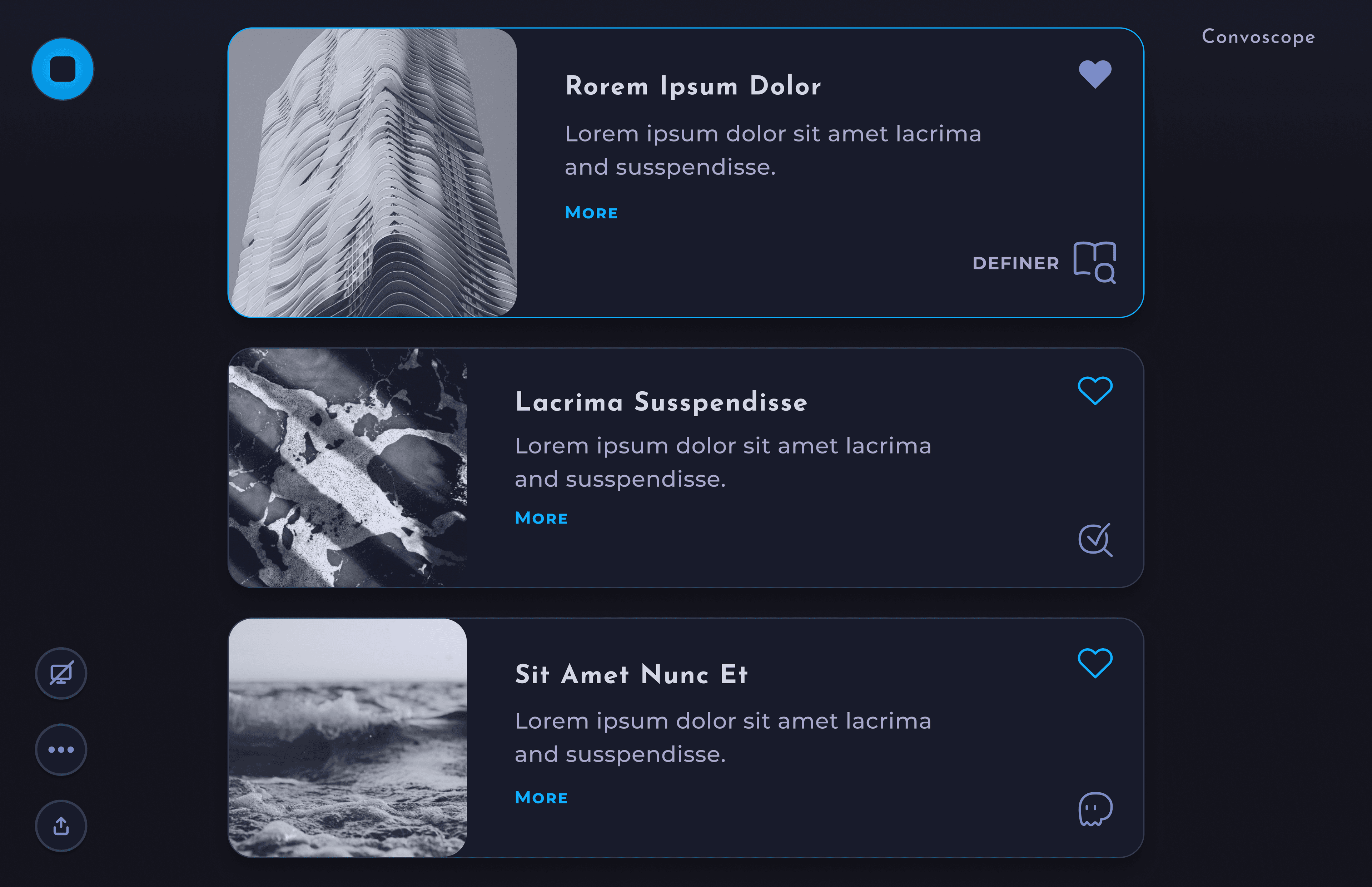
Speaker View– Participants only see info the speaker selects.
Sign Up– Sign Up Flow and First time Use.
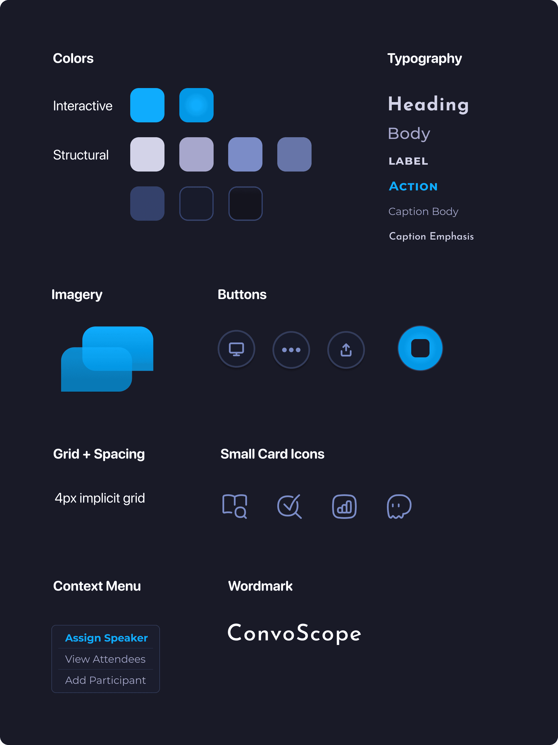
Style guide
I created a style that evoked academia, while also reflecting a moody otherworldly, biological atmosphere requested by the stakeholder. For example, the puffiness of the icons and rounded corners felt more based in nature than harsh edges would. In additon, the font helped evoke the science fiction vibes that we desired.
Animations
Annimations were included to both evoke the sense of otherwordliness, and natural phamana, and to communicate to the user something was happening. First example of this is the "Hey Convo" feature.
In order to avoid the user disrupting their flow and resorting to using other tools, such as as search engine, it was essential to have a feature allowing impromptu questions. The given animation convays the active listening of ConvoScope, inspired by "Hey Siri."
An simpler, yet purposeful, annimation is used for the start button during a ConvoScope session. The button pulses like a beating heart to help indicate the session is in progress, even if no cards have apeared yet. The speed was carefully chosen to be slow enough to not be distracting, but fast enough to be noticed.
Another animation worth discussion is on the login screen. The main purpose here is to use an animation inspired by heavenly bodies to set the tone of the application immediately. The same animation is used at the start of every session.
Reflections
Learn by Doing.
During this design project, I grew my skills an incredible amount. From components, to finding the middle ground with stakeholders, my mind is awash with possibilities for the future.
Take-aways
- Go slow to go fast. For my next project, I resolve to use reusable components in Figma earlier in the design process. At the right moment, taking the time to create well chosen components will pay-off in spades later.
- Validate the feature set and challenge it when appropriate. For example, Speaker Mode might add undesirable cognitive load to a speaker who is curating the ConvoScope content while simultaneously giving the lecture. Given more time, gathering more data around this, and other alternatives, could be fruitful to create a better product in the long run.
- Refine tooling. I used Adobe After Effects to create the moving assets. It is a powerful tool but a bit clunky. Therefore, I might try X for more simple tooling in the future.
- I learned how to fish. It was tricky to handoff the animation assets. Through a series of onerous experiments we discovered that gifs are too low quality, MP4s don't support transparency, Lottie files do not support blending modes or complex gradients, and animated svg doesn't support complex gradients. In the end we resorted to animated PNGs. In the future I would start there ;).
- Start with the essential. For this project, I started by designing the desktop app. Next step will be to design the smart glasses app. In future, it could be better to begin with the more limited interface (e.g. the smart glasses) in order to discern what are the most essential features for the product. I suspect that it can be more straightforward to adapt from a limited interface to a more expansive one, rather than vice versa.
Smart Glasses, Here I Come
The next iteration will involve creating a smart glasses interface. I’m pumped for my next learning journey!