ThoughtFilter
Designing an experimental AI interface for MIT Media Lab researchers.
My Role
Product Designer – Interaction Design, UX Design, Visual Design, User Flows, User Research, and Prototyping
Timeline & Status
Q4 2024 Design Stage
Currently in Development
Team
Ayon Bhattacharya, SE Architect
Carrie Pack SME
Carrie Pack SME
Overview
Freelance copywriters often find themselves producing high volumes of content on uninspiring topics, diverting time from more meaningful projects.
In response to this disconnect, I led the design of Thoughtfilter. This tool streamlines content marketing workflows through advanced AI and optimized content editing techniques.
I designed the application, from ideation to the development of final prototypes. Thoughtfilter is now in development, poised to transform the daily routines of content marketers.

The Problem
Freelance copywriters aim to create engaging think pieces, but often spend most of their time on repetitive long tail articles about uninspiring topics.
And yet, source control is a necessary tool used everyday by most software engineers and is essential to master as an SE student. Many of our users were fed up with existing tooling and found git onerous. They felt git CLI was clunky when performing actions such as undoing mistakes, managing stashes, and viewing committed or staged changes.
Highlights
Enhanced workflow efficiency and content quality.
This tool not only addresses the critical pain points in content marketing, such as keyword optimization and efficient content reuse but also integrates seamlessly into the daily routines of content creators.
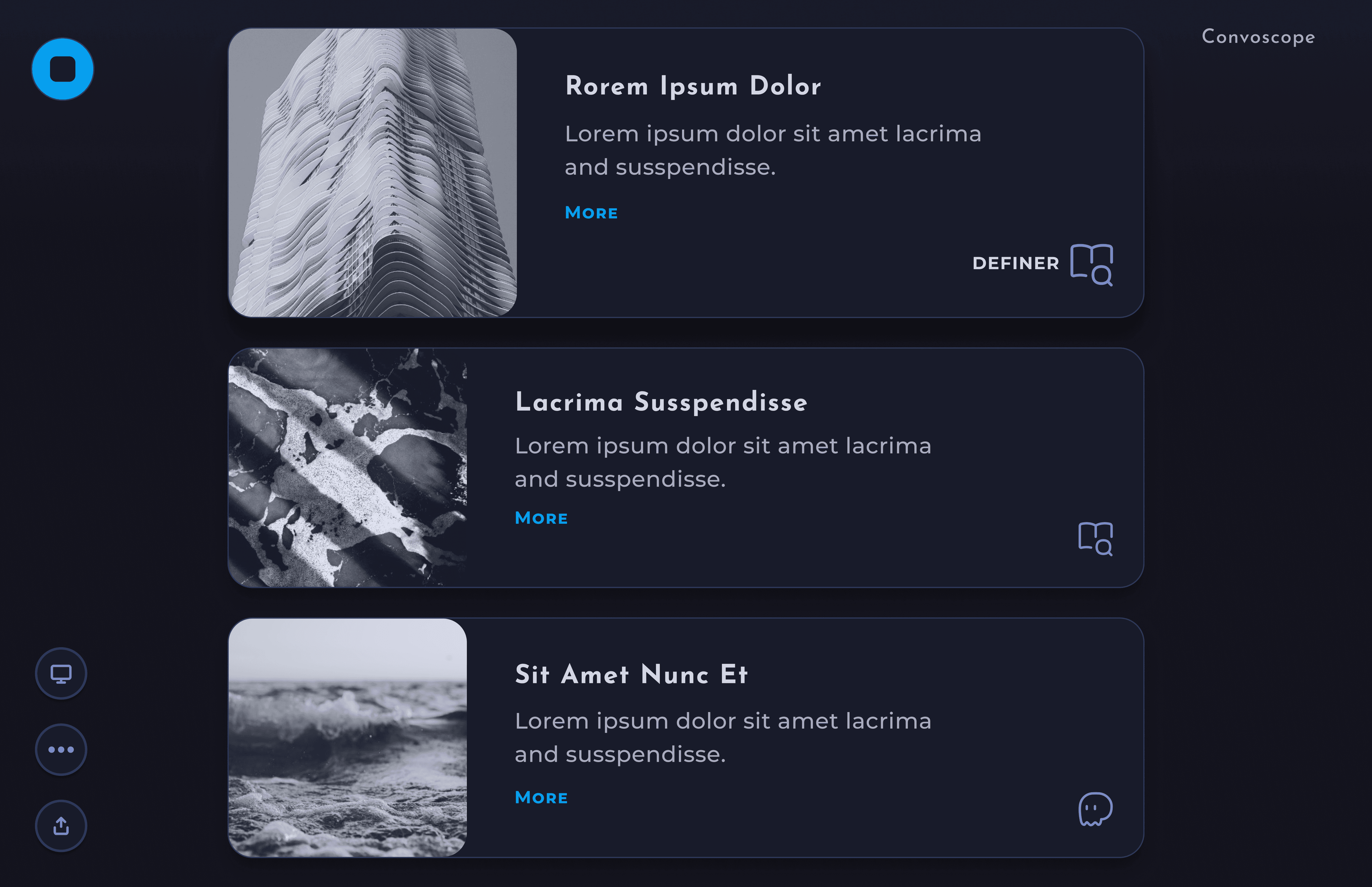
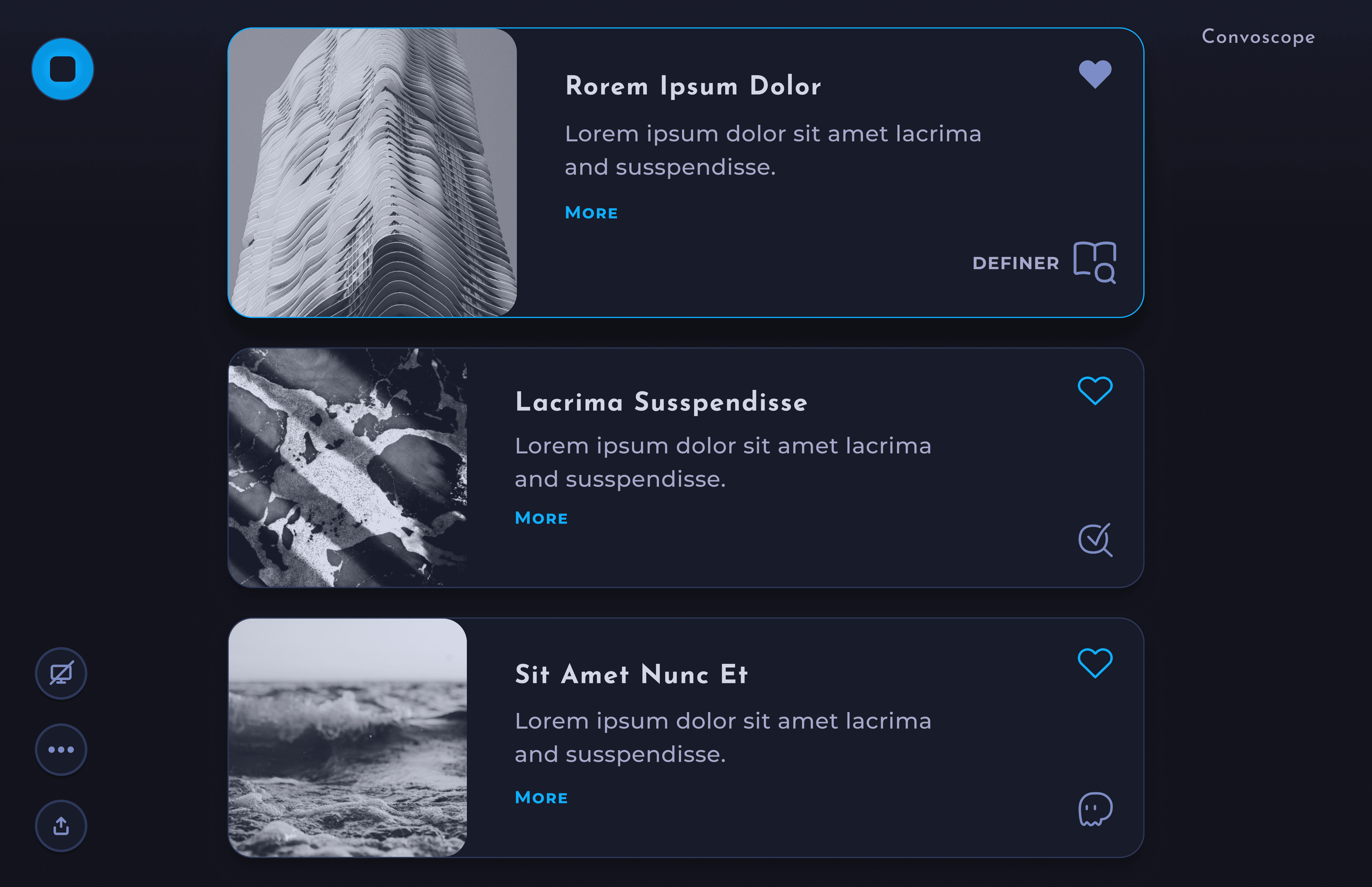
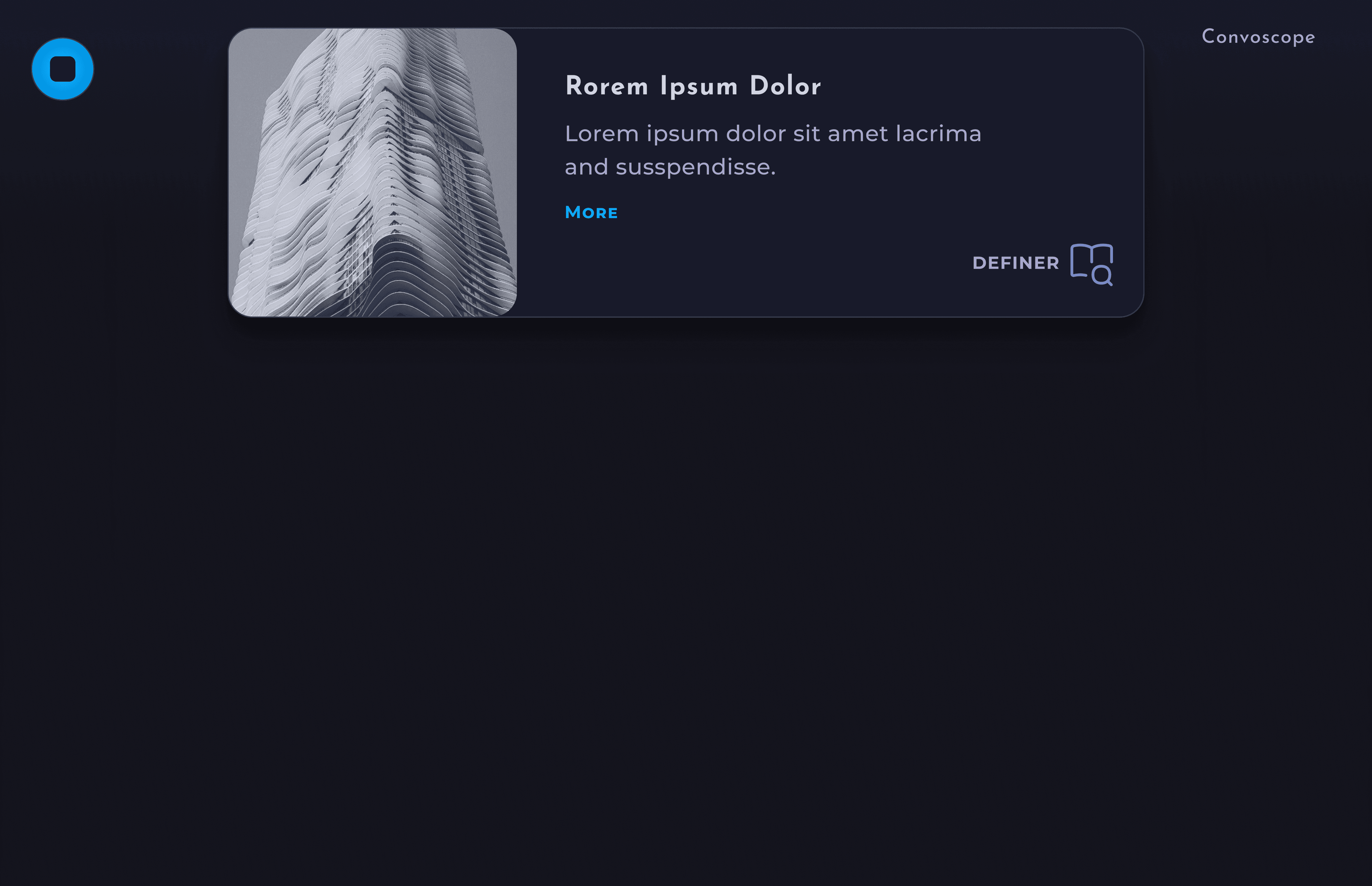
Input Form- This feature includes a form equipped with essential parameters, allowing users to quickly generate keywords and upload relevant research documents. It facilitates a seamless transition to generating your first draft without any friction.

Filter History
Quickly locate old files that
need to be reworked
need to be reworked

Search History
Search previous content
by keywords and more
by keywords and more
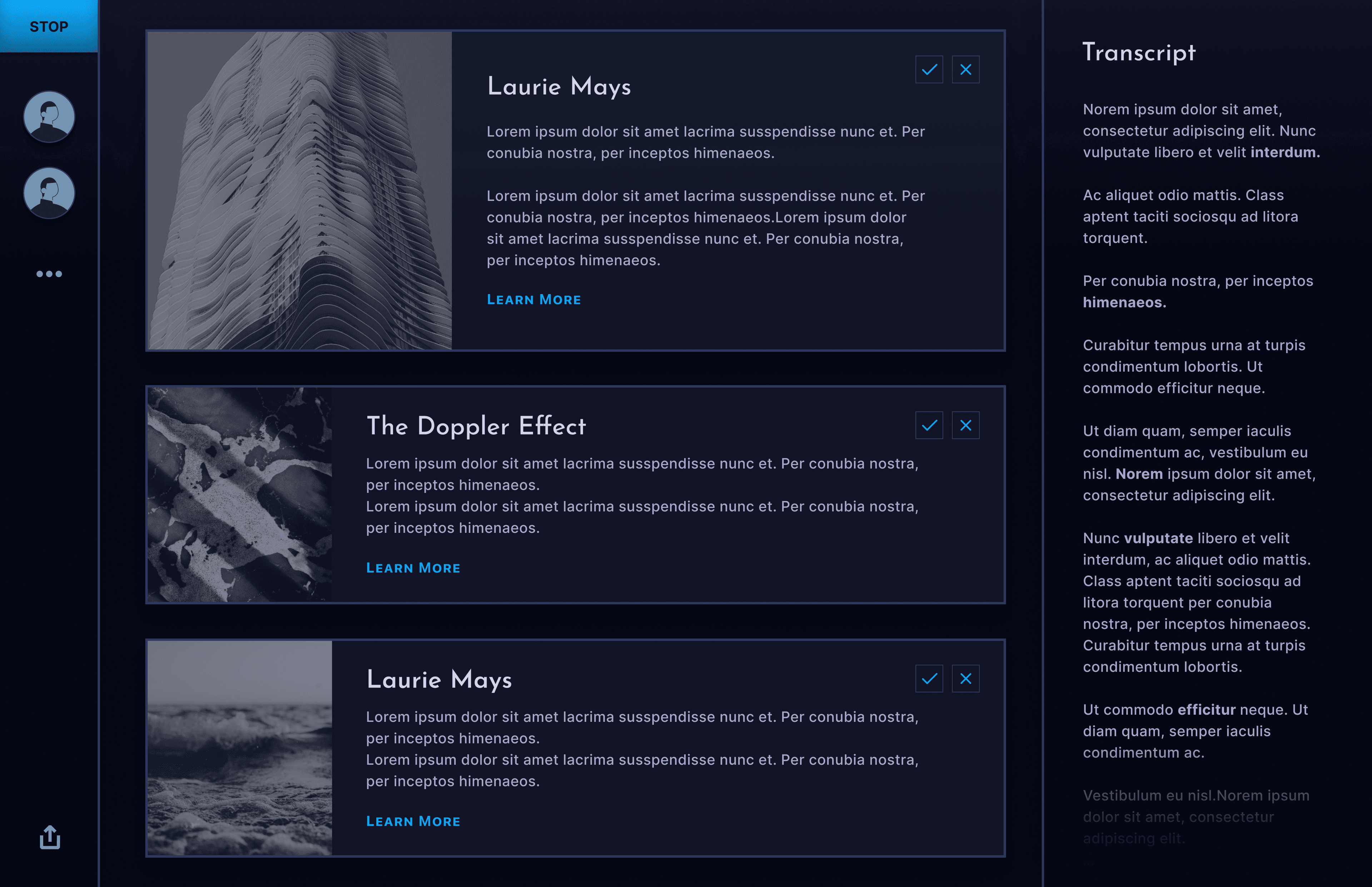
Editing- AI-generated suggestions designed to help you refine your document more efficiently.
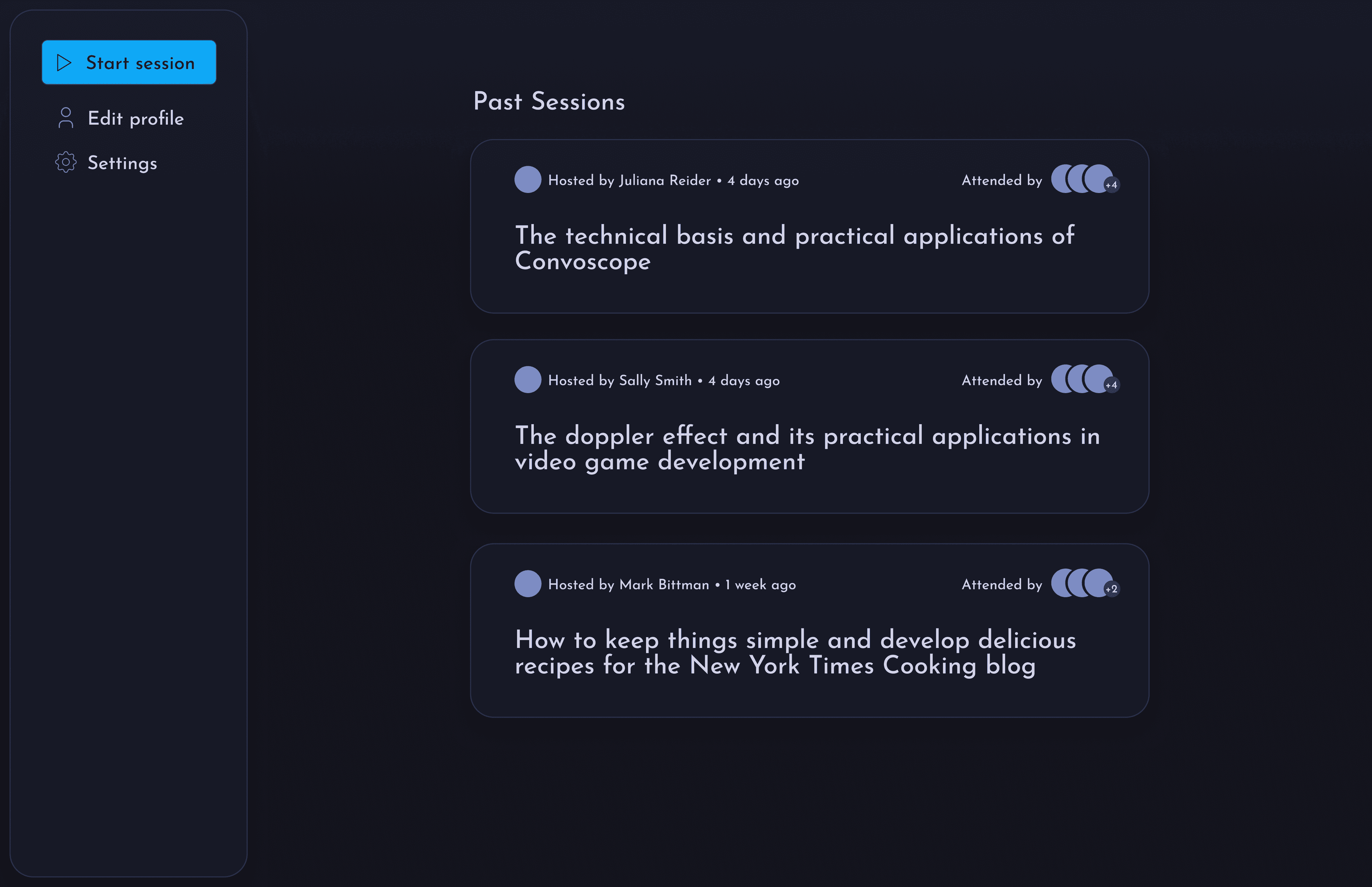
Project history page– Easily access old content .
Filter and search– This feature includes a search and filter function on the project history page, enhancing usability. [Gif?]. It's especially useful for content marketers who frequently need to find and refresh older content.
Research
An in-depth exploration into the challenges and workflows of content marketers.
In this study, I identified typical workflows and key issues. Direct feedback from users throughout the design process, provided valuable insights.
Workflow Insights
• Content Creation: our target users typically utilize a systematic approach starting from research notes, followed by building structured outlines.
• Content Reuse: content marketers are constantly asked to refresh old content to ensure quality and relevance.
• AI Utilization: There is a notable lack of AI tools that effectively integrate keyword optimization without compromising originality.
• Content Reuse: content marketers are constantly asked to refresh old content to ensure quality and relevance.
• AI Utilization: There is a notable lack of AI tools that effectively integrate keyword optimization without compromising originality.
Main Insight
Content marketers, especially freelancers, face immense pressure to deliver a high volume of quality content.
Other Key Challenges

Context Switching: Frequently shifting between different tasks.

SEO and Keyword Optimization: users must increase keyword utilization while avoiding poaching or stuffing, and keeping up with Google's algorithm.

Time Management: common tasks such as transforming ideas into polished content and refreshing stale content is time-consuming.
Ideation
Progressing towards a powerful solution through iterative design.
Before diving into the more detailed designs, I started with some quick iterations with hand drawn ideas, and moved onto low fidelity wireframes in figma.
Minimal Lo-fi Sketches

Hand-drawn initial concepts. Low-fidelity sketches are used to explore initial ideas quickly.
Wireframes
Before advancing to intricate design concepts, I began with rapid iterations of hand-drawn sketches and progressed to creating low-fidelity wireframes in Figma.
Iterations and Deliverables

Design Files
Utilized Figma and FigJam for
all design artifacts
all design artifacts
Engagement
Gathered continuous feedback
from users
from users

Collaborative Development
Planned a series of meetings with
the developer to ensure quality
the developer to ensure quality
Initial Directions
Ready. Set. Brainstorm!
Time for a branding exsercise. I utilized branding exercises to define the application's visual and interactive identity ensuring consistency and alignment with user needs and preferences.
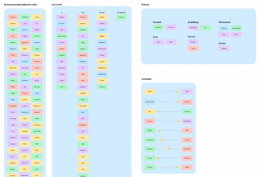
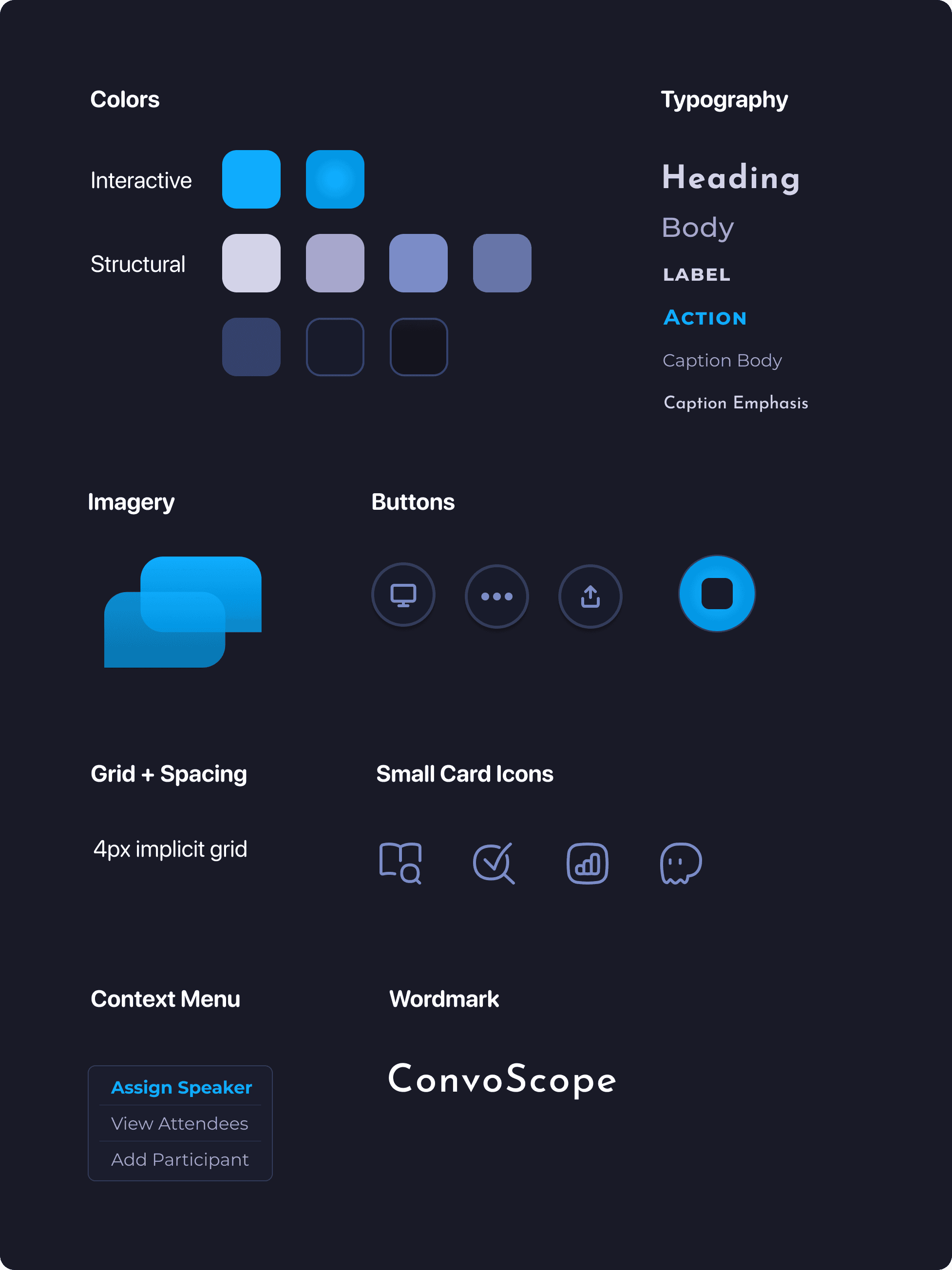
Honing a design language– I refined the design language of the application through extensive style iterations, focusing on crafting a warm, inviting, and friendly aesthetic that aligns with our branding discussions.
Initial Directions– I finally landed on this color that is reminiscent of antique Paper or paper in classic books, which aligns with sense of warmth and knowledge I wanted to bring to the product.
At one point I explored a significantly more playful style, containing more saturated colors and sketch shape graphics, (shown below), but left it behind in favor of more professional style in order to give users a greater confidence in the rigor of the tool and to avoid distracting design that would impede the use of the tool itself.
Testing + Improvements
Revise, Revise, Revise.
To create the optimal product, it's crucial to actively listen to, and prioritize user feedback. Throughout the design process, I made strategic updates based on this input to maximize the product's impact. Below are some key improvements made during these iterations.
Core Navigation

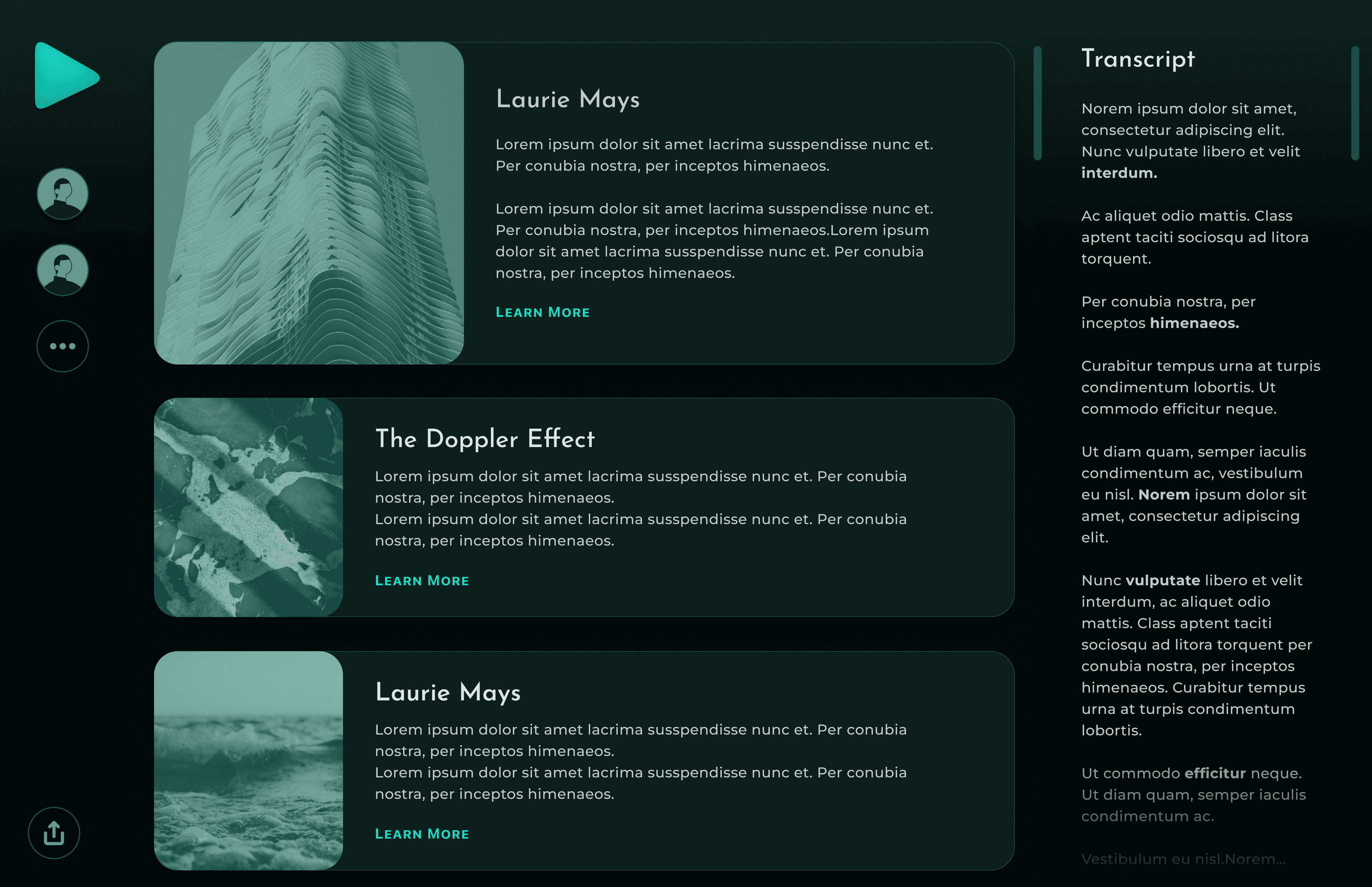
Before: The Navigation was hidden away.

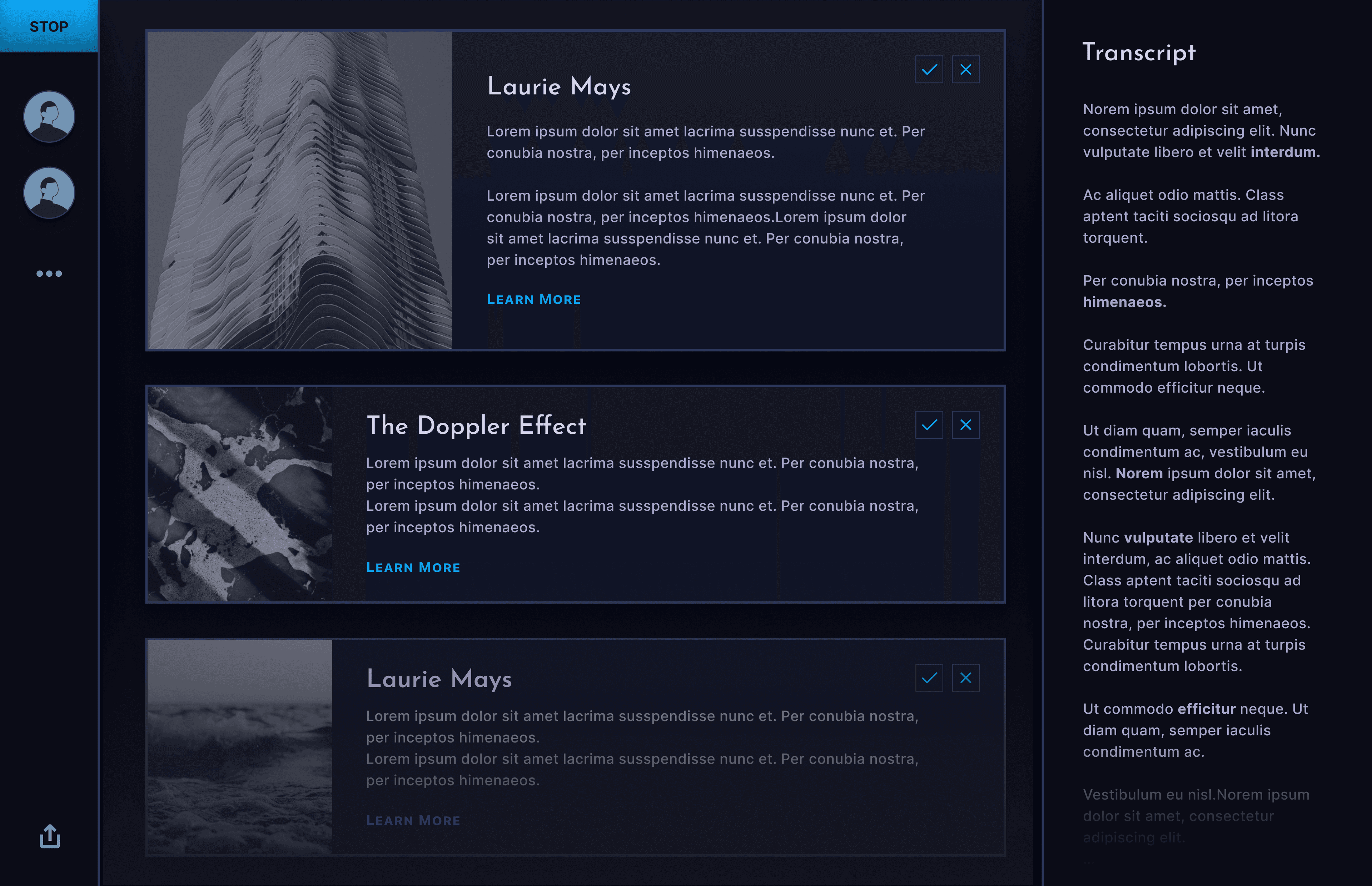
After: I revised the core navigation paradigm to feel more familiar and stable throughout the app.
Versioning
After: Put emphasis on the current work instead of the full set of variations since I determined that was more valuable for the users.
Editing improvements
Before: Manual and didn’t take advantage of the power of AI to optimize the editing process.
After: Revised the editing screen to include sleek AI editing tools which made using the app to be more of a joyful and focused writing experience.
Inspiration from great writing tools like notion, ghost, obsidian and IAwriter.
Project History Page development
Before: The application had not addressed the common user habit of switching between many different articles.
After: tbd.
Final Design
Excitement for what I’d designed.
The final design of the tool successfully addressed the critical challenges highlighted during the research phase, offering tailored solutions that enhance both efficiency and user satisfaction.
subheading
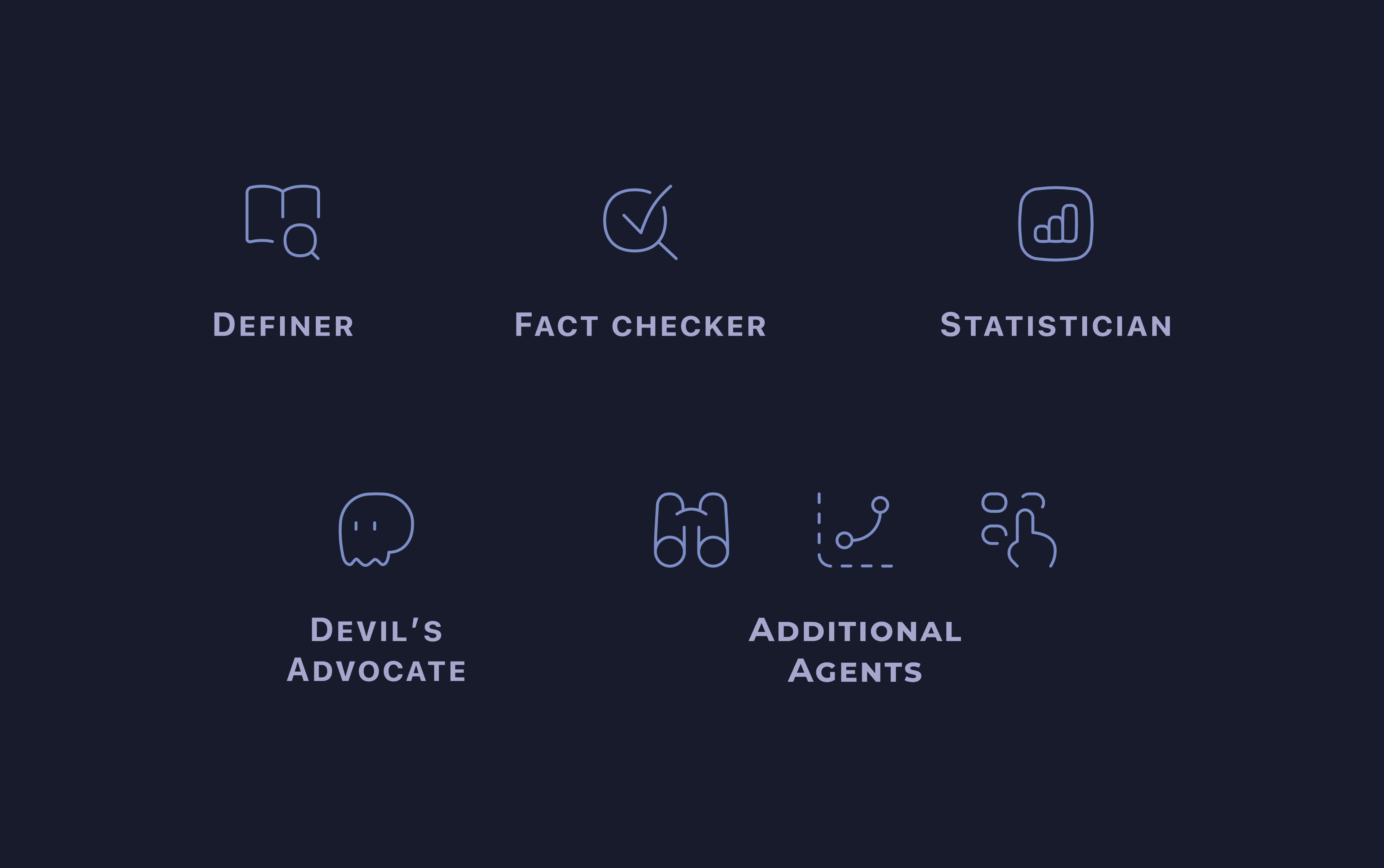
Comprehensive AI Tool– An AI tool that assists with keyword research, optimizes content without keyword stuffing, and provides recommendations for SEO enhancements.
Something– Something Something Something. Something Something.
Editing and Optimization: Simplifying the keyword optimization process and integrating document generation to minimize context switching and improve efficiency.
Fit into existing workflow: research notes should be used as input. The tool should output structured outlines and/or completed articles. The tool ideally would also function as a refreshing tool for the common task of content reuse.
Show Video of the prototypes not shown yet Onboarding experience End to end flow?
Style guide
something something Somthing.
Reflections
The only real mistake is the one from which we learn nothing.
tbd tbd.
Take-aways
- Collaborative Synergy Reflecting on the continuous back-and-forth with the development team, I've come to appreciate how vital it is to sync design thinking with technical possibilities from the get-go. This collaboration wasn't just about making things easier; it was crucial for bringing our design visions to life in a practical, functional way. If i put the in i need to have to think of an example. It was a reminder of how pivotal real user feedback is to crafting solutions that genuinely resonate.
- Deep Dives into User Needs: The extensive user interviews deepened my understanding of what content marketers truly need, guiding the tool’s design from the start to better suit their daily challenges. f i put the in i need to have to think of an example.
- Evolving with Feedback. The journey from initial concept to final design was filled with pivotal decisions, especially about aesthetics and user interface simplicity. Adapting our approach based on user feedback really highlighted the fluid nature of design, where you start with a design language that evolves, sometimes drastically, to meet real-world needs and preferences.
- Something from the heart. tbd
- Something from the heart. tbd
This is just the tip of the iceberg. Feel free to check out some of my other work!